d2jsp
Log InRegister
d2jsp Forums > Off-Topic > Entertainment Room > Anime > The Official Anime Sig Showoff Thread > post all your fan works here
Prev1732733734735736851Next
Add Reply New Topic New Poll
Member
Posts: 8,196
Joined: Oct 16 2009
Gold: 0.00
Nov 16 2009 04:19am
Clannad Ftw :hail:


ps: y that db gt sig wasn´t that good, just did it in a hurry for fun... wasting time....
Member
Posts: 13,630
Joined: Oct 21 2007
Gold: 5,000.00
Nov 16 2009 08:01am
Sogeking, that Kakashi sig is pretty awesome. Although the font could be lots better, but I like it very much. Is it made by you :O ?
Member
Posts: 8,196
Joined: Oct 16 2009
Gold: 0.00
Nov 16 2009 08:29am
Quote (greydoom @ Nov 16 2009 05:01pm)
Sogeking, that Kakashi sig is pretty awesome. Although the font could be lots better, but I like it very much. Is it made by you :O ?


a mate helped me :P hmm y perhaps I will change the font... will see.
Member
Posts: 17,213
Joined: Jan 22 2009
Gold: 0.00
Nov 16 2009 08:33am
I like mine. 'o_o
Member
Posts: 8,196
Joined: Oct 16 2009
Gold: 0.00
Nov 16 2009 10:03am
another naruto fan work :P

Member
Posts: 20,002
Joined: Dec 13 2006
Gold: 153.98
Nov 16 2009 09:28pm
Quote (MidnightRider @ Nov 15 2009 02:21pm)
Yeppers, I did, like Niteriche said.

Sogeking - You might want to try sharpening the tag a little, seems a bit blurry.


Glad to see more work  ^_^ 
For a third sig, it looks pretty solid.  As you suggested, the color choice is a bit strange xD
For future works, try to work on blending - better colors will help with this as well.


i actually like it alot. n1 tag m8.
Member
Posts: 5,217
Joined: Jan 14 2007
Gold: 893.00
Nov 17 2009 11:38am
Quote (theangeloffury @ Nov 13 2009 08:39am)
Hey man, crack open PS yet?


I haven't. I've been sick non stop for the past 2 weeks. That and I reformated my comp and haven't got PS on it yet. What version should I get?
Member
Posts: 31,175
Joined: Sep 19 2006
Gold: 1.11
Nov 17 2009 11:22pm
Quote (MidnightRider @ Nov 15 2009 01:21pm)
Yeppers, I did, like Niteriche said.

Sogeking - You might want to try sharpening the tag a little, seems a bit blurry.

http://i55.photobucket.com/albums/g152/ShadowHitokiri/SkikiVertNt.png


Glad to see more work  ^_^ 
For a third sig, it looks pretty solid.  As you suggested, the color choice is a bit strange xD
For future works, try to work on blending - better colors will help with this as well.


vvn1
Member
Posts: 11,881
Joined: Aug 17 2007
Gold: 0.00
Nov 18 2009 05:11pm
Quote (SPARKLES @ 18 Nov 2009 00:22)
vvn1


Thankies ^_^
Sotw this week is anime theme, if anyone wants to enter.
My computer is shot, so I won't be able to finish meh tag, but I"m entering anyway. ^_^
Don't really like the tag though.


Quote (HEIDTB @ 18 Nov 2009 18:13)
looks like u had hella idea

thicker the border gets

also, i wanna enter but idk im lost.


Enter! You'll probably beat the crap out my entry.
Lol, I have a no border version, but the edge is choppy and I can't edit it since my computer is being mean.


This post was edited by MidnightRider on Nov 18 2009 05:15pm
Member
Posts: 48,059
Joined: Feb 13 2008
Gold: 0.00
Nov 18 2009 05:13pm
Quote (MidnightRider @ Nov 18 2009 11:11pm)
Thankies ^_^
Sotw this week is anime theme, if anyone wants to enter.
My computer is shot, so I won't be able to finish meh tag, but I"m entering anyway. ^_^
Don't really like the tag though.


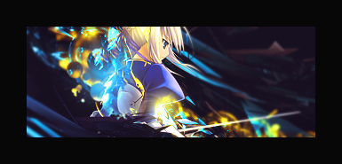
http://i55.photobucket.com/albums/g152/ShadowHitokiri/Sotw2Black.png


looks like u had hella idea

thicker the border gets

also, i wanna enter but idk im lost.
Go Back To Anime Topic List
Prev1732733734735736851Next
Add Reply New Topic New Poll