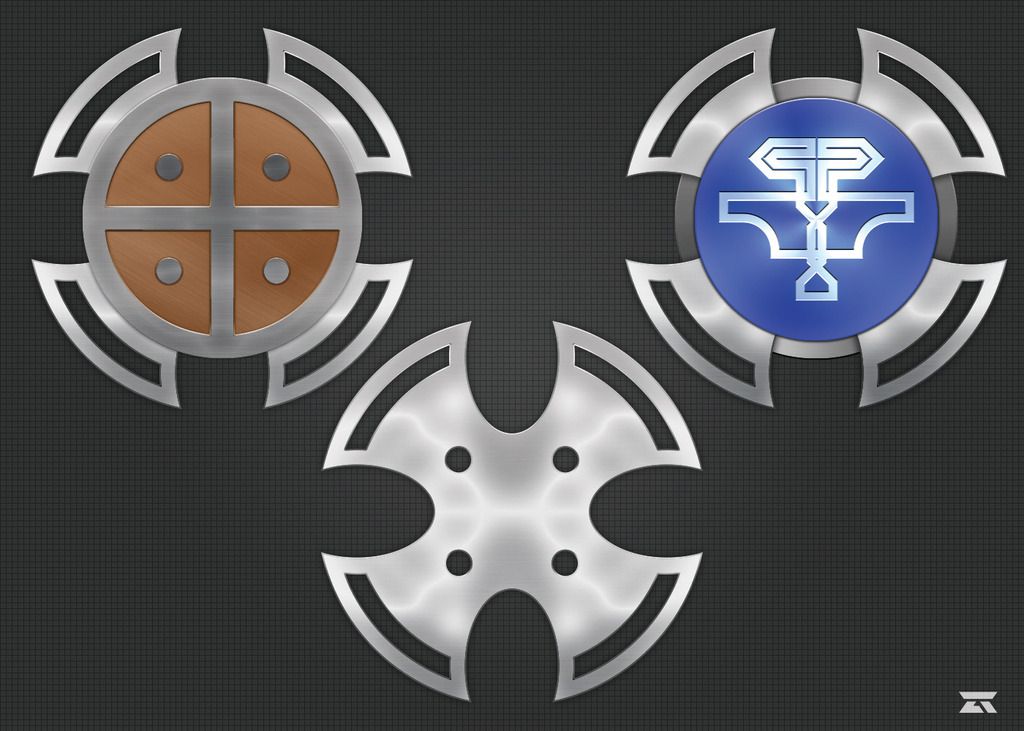
So one of my old hobbies was DnD, loved it. I used to sketch out intricate weapon/armor designs for fun and that was a solid time killer. I recently got back into it and once again found myself sketching out weapon/armor design, so I figured fuck it, lets throw them into AI and skin them in PS, just for fun, mainly as an exercise to get better with AI.
I have never actually done this with anything before, so they might not look too good/realistic. I am mainly looking to see what I could do to make them look more realistic, down to minor details like adding in or removing certain aspects. Currently the only one I have done the full process for is a shield, mainly one that would also be used as a throwing shield so some flair to add in to that. Lighting is something I haven't quite nailed down either, as you can most likely tell. I'm not the best with making multiple objects stacked look like they are their own object while still appearing to have the same lighting/light source.

So, if anyone has any tips I'd love to hear them.
*You may now commence the flame and rage of the incredible nerdiness of this post*