Quote (Fault @ Oct 9 2012 06:16pm)
Great progression thus far. From the first signature to your currently last posted work, you have improved.
A couple words of advice that you may want to heed:
Stay away from pop-outs entirely. I know that this form is what a lot of people request, but for learning purposes it's not a great thing to practice on.
Try to familiarize yourself with all the tools of photoshop, and try to work on basic things first. Once you understand the basics, you can then apply that knowledge to more complex matters.
A lot of people recommend beginners to use tutorials, and it's for a good reason. Search around the web for various tutorials and practice with them. We have a great selection of potential tutorials throughout GD and the Q&A section.
For the most part, try to stay away from typo on your work unless you are specifically making it for someone.
I see why that could be more helpful
Things I currently want to figure more out about are clipping masks, making smudge sigs look good, and integrating some really nice blending using shapes and effects. I honestly don't even know how the person achieved this :
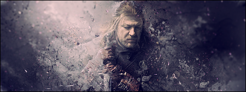
But I'd love to find out.
I think the part of doing popouts that has helped me has been finding out what shapes look good with the characters. It's a way to try not to over complicate and clutter the signature, and just try to find a shape that compliments the character inside. It's actually helped with my square signatures because I have a good concept of when it's too noisy and when I should scale it back a bit.
Do you suggest just using microsoft default fonts?
I have more work to post. Here are the next two!

- Completely from scratch, using textures shapes and effects. SOLD to Solicit for a guild banner.

- Attempt at Temple Jax