d2jsp
Log InRegister
d2jsp Forums > Off-Topic > Graphic Design > Digital Painting Progress > Brushed Pixels
Prev1910111213133Next
Add Reply New Topic New Poll
Member
Posts: 33,012
Joined: Jan 21 2008
Gold: 120.00
Sep 26 2010 01:09pm
Any other cnc?
Member
Posts: 33,012
Joined: Jan 21 2008
Gold: 120.00
Sep 26 2010 06:30pm
non?
Member
Posts: 17,072
Joined: Oct 1 2005
Gold: 140.00
Sep 26 2010 07:31pm
Quote (UncleMuscles @ Sep 26 2010 08:30pm)
non?


You need a lot of practice on the human form, and proportions. colors are alright but I think could be more assertive, and your brush strokes could also use inlargeining. [made up word]
Member
Posts: 33,012
Joined: Jan 21 2008
Gold: 120.00
Sep 26 2010 07:32pm
Quote (FloraFreak @ Sep 26 2010 07:31pm)
You need a lot of practice on the human form, and proportions.  colors are alright but I think could be more assertive, and your brush strokes could also use inlargeining.  [made up word]


what is wrong with the from and proportions? wondering :O
Member
Posts: 17,072
Joined: Oct 1 2005
Gold: 140.00
Sep 26 2010 07:37pm
Quote (UncleMuscles @ Sep 26 2010 09:32pm)
what is wrong with the from and proportions?  wondering :O


she has little children's feet, no calf muscles, no knees, her spin is as though it is facing us though she is catty-corner us, she has a man left shoulder and a female right one, her bisep is a bit large while her forearm is not proportional.

The lighting appears to be what she is facing, yet the most cast shadow is her right side. Where if it was in front of her or to the left a bit, it would reflect off the wall giving a some small lighting to that area.
Member
Posts: 33,012
Joined: Jan 21 2008
Gold: 120.00
Sep 26 2010 07:38pm
Quote (FloraFreak @ Sep 26 2010 07:37pm)
she has little children's feet, no calf muscles, no knees, her spin is as though it is facing us though she is catty-corner us, she has a man left shoulder and a female right one, her bisep is a bit large while her forearm is not proportional.

The lighting appears to be what she is facing, yet the most cast shadow is her right side.  Where if it was in front of her or to the left a bit, it would reflect off the wall giving a some small lighting to that area.


thanks :(

scrapped ;p

back to sketching more
Member
Posts: 17,072
Joined: Oct 1 2005
Gold: 140.00
Sep 26 2010 07:39pm
Quote (UncleMuscles @ Sep 26 2010 09:38pm)
thanks :(

scrapped ;p

back to sketching more


Also, the spine.

That is a great way to show her curves, from what I see from the back it could be a guy. she should have a curvy spine to match the position shes sitting in.

Edit: all in all, its not bad. and you already seem to grasp the secrete to success

This post was edited by FloraFreak on Sep 26 2010 07:41pm
Member
Posts: 33,012
Joined: Jan 21 2008
Gold: 120.00
Sep 26 2010 07:48pm
Quote (FloraFreak @ Sep 26 2010 07:39pm)
Also, the spine.

That is a great way to show her curves,  from what I see from the back it could be a guy.  she should have a curvy spine to match the position shes sitting in.

Edit:  all in all, its not bad.  and you already seem to grasp the secrete to success


far from it =/
Member
Posts: 11,580
Joined: Dec 4 2009
Gold: 8,765.00
Warn: 10%
Sep 26 2010 08:01pm
Quote (FloraFreak @ Sep 27 2010 11:37am)
she has little children's feet, no calf muscles, no knees, her spin is as though it is facing us though she is catty-corner us, she has a man left shoulder and a female right one, her bisep is a bit large while her forearm is not proportional.

The lighting appears to be what she is facing, yet the most cast shadow is her right side.  Where if it was in front of her or to the left a bit, it would reflect off the wall giving a some small lighting to that area.


:rofl:

idunno how but i missed most of these paintings...

a few of them are good like the beach ones etc

i noticed your actually using alot of different shades which is an improvement from this, (one colour with lines painted over the top)
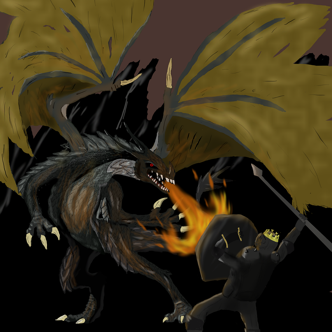


goodjob, keep doing more sketching of the female anatomy and you will get it

This post was edited by iSteroids on Sep 26 2010 08:04pm
Member
Posts: 33,012
Joined: Jan 21 2008
Gold: 120.00
Sep 26 2010 08:04pm
Quote (iSteroids @ Sep 26 2010 08:01pm)
:rofl:

idunno how but i missed most of these paintings...

a few of them are good like the beach ones etc

i noticed your actually using alot of different shades which is an improvement from this:

http://i129.photobucket.com/albums/p217/techno_tanner/Paintings/dragon4copy.png


oh god that was so early lmfao that stuff is baddddddddd

e:/ ofc the female is the best to sketch :thumbsup:

This post was edited by UncleMuscles on Sep 26 2010 08:07pm
Go Back To Graphic Design Topic List
Prev1910111213133Next
Add Reply New Topic New Poll