Classes:Week 1 - The BasicsWeek 2 - Resources and InspirationWeek 3 - Criticism and Advanced LearningWeek 4 - Battles and ContestsTournament 1 - ResultsWeek 5 - SmudgingMovies:
Week 4.5 - The Creative GapWeek 6.5 - Helvetica Week 6 - Typography
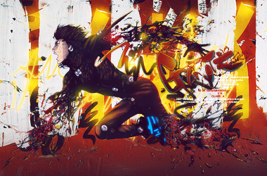
This week will be about typography obviously, but the main parts will be how fonts are made, inspirational typography pieces, and my opinion on signature typography. To start though, we need to define what typography is.
Typography is the art and technique of arranging type in order to make language visible. The arrangement of type involves the selection of typefaces, point size, line length, leading (line spacing), adjusting the spaces between groups of letters (tracking) and adjusting the space between pairs of letters (kerning). Type design is a closely related craft, which some consider distinct and others a part of typography; most typographers do not design typefaces, and some type designers do not consider themselves typographers.
Shortened: Typography is the art of arranging type in order to express thoughts.
How fonts are made (today)If you read the above stuff then you might be saying this isn't typography this is type design! Well, you are right but I think fonts on their own have an art and if you understand fonts better it could help you understand typography better but I won't make you try it out.
http://ilovetypography.com/2007/10/22/so-you-want-to-create-a-font-part-1/This link should give away what its about right away but this is an article on ilovetypography.com that explains how to make your own fonts and even if you don't make your own its still something you can look at real quickly to see what they do.
http://www.dafont.com/This is a great source of fonts for free, it also says how to install them right on the front page. I suggest looking through here for cool fonts now and again.
- Blane
Inspirational TypographyIts hard to just show a piece and say, "Oh, this is the best way to do typography!" because typography is so complex. My hope with these links is to show you some places to find really well done typography and spark some ideas for typography pieces or signature typography. Instead of just looking and saying, "That's cool *next image*" try to think about how they did it, and most importantly WHY they did what they did to achieve whatever goal they were going for.
http://bluefaqs.com/2010/05/60-amazing-typography-based-posters/This one is awesome, almost every single piece on this page shows how to make really great typography.
http://desigg.com/design-inspiration-logotype-and-typography/This one is also pretty cool but I feel its not as consistent with the awesome works as the first link. Still worth a look through though
http://typeinspire.com/Theres some cool ones here as well, but there's also tons of mediocre pieces (imo) so keep that in mind.
 Signature Typography
Oh boy, where to even start has been driving me nuts for awhile, but I'm going to try my best to explain what I think about this.
Be warned, this is a lot of my opinion, don't quote it as truthsSo, as you well know, signature typography is a total pain in the ass. Whether you want to just add your name or add some other text, you will spend a lot of time going through variations.
I feel the best ways to learn signature typography are:
1. LR PSDs, this is because you can literally open it up and see how they made the typography, what settings and what types of adjustments they did.
2. Looking around the world for inspirational typography can lead you to finding out cool compositions for type that you might not have ever thought to try.
3. Experimentation! This is the most important because this is how people come up with the new and awesome typography styles that you find in the first two examples. Whether you are doodling font, messing with it on signatures or just opening new files and working with text only, it is great to just keep trying to get it.
I do not have a guide to making typo or any sort of all inclusive guide to typography because honestly it just doesn't work like that. If you just say, "I like Helvetica! I want to use it on everything!", it won't work. Good typography isn't just about the type, but how it interacts with the existing piece it is being place on.
The most important thing to consider when working with typography isn't "what?" or "where?" or even "how?" but instead "why?". The why is the most important because if you don't know why you are putting text on a signature then there's no way you will figure out the rest of it.
Say you learn to make icy text and you really like that style. If you then try to put it on a firey signature, it won't make sense at all. Likewise if you open a psd and copy all the settings from the persons font, you don't suddenly understand WHY they did what they did, only how. So I really hope you guys who want to get better at typography consider the why before you consider the what, how, where.
Some basics that generally apply to signature text:
0. Make sure its worth adding the typography in the first place, if it just doesn't work it just doesn't work.
1. Don't ignore the basics of design (such as focal, flow, or color. Too many people put font that breaks these)
2. Putting text in the corner is almost always a bad idea, try to avoid this usually.
3. Fonts have tons of options (such as the kerning, spacing, weight, size, italics, bold, opacity) so remember that you can try to play with those!
4. You can put clipping masks onto typography, this can look nice sometimes, but its not something to just fallback on.
5. Look at different fonts before you settle on something because you could find something that is a better fit if you just spend a few more minutes.
6. A good selection of fonts will help you fit more situations. An example is futurish fonts work well with futurish sigs, if you don't have any then try to look for some.
Feel free to also look at Odin's guide, it has a typography section. Or any other typography guide for that matter, maybe they explain it better.
Assignment:1. Read the stuff above if you want to learn about typography
2. Go look through the links at cool typography
3. Either try to add some typo to a previous sig, make a new one involving typo, or find a signature with good typo and bring it here and we will help you understand what its made of / why it might have been added
4. If you didn't make a signature in step 3 then make a new one now and try to keep in mind everything you've read here.
This post was edited by TheReborn_Magi on Oct 11 2011 01:49pm