My apologies for the potentially early bump, but I seem to have failed at clearly explaining my iso, got a lot of questions via pm that I want to clarify right now!
MORE DETAILS / IMPROVED DESCRIPTION OF ISO
I published an Android app, and now I need help with making an epic icon! (by help, I mean it would be better if someone else did it - my many attempts have all been terrible at best)
The app has a FREE and a PAID version, each of which needs an icon.
The icons for the FREE and PAID versions should be IDENTICAL in every way, except for the color scheme.
(EXAMPLE: FREE icon = a blue circle / PAID icon = an identical circle, except red instead of blue)
(the second screenshot of the first post of this thread is a good example of identical icons with different colors).
The colors should NOT be "girly" (most of my user base is male) - please stay away from pink/purple/etc.
Now that we've established it is essentially one icon, rendered in two different color schemes, following are additional (equally important/essential):
FORMAT:- 24bit png /w alpha (which is apparently what u call the 32bit png I thought i was iso)
- 512px x 512px IMAGE SIZE
IMPORTANT NOTE:You are making an icon. It will almost never appear at its full 512 x 512 resolution.
More often than not, it will be automatically scaled down by the Android system.
For this reason, the icon must look the same, and be perfectly clear and legible at all zoom levels between 10% and 100%.
The 1st picture in the 1st post of this thread illustrates a good and bad example of an icon scaling. (notice how 2nd image (in the first screenshot) looks great at 512 x 512 but terrible at icon size on a cell phone screen)
Also check out this image hosted by google on icons and screen resolution:
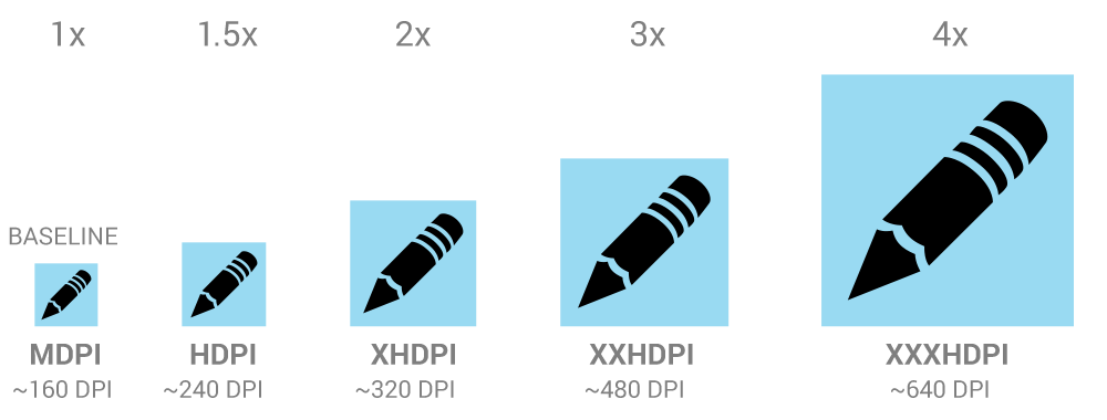
Same exact graphic, perfectly clear, and identifiable at all sizes.
Now for some aesthetic requirements:The app you are making the icon for is:
https://play.google.com/store/apps/details?id=l.werner.livewallpaper.hypnosistimefreeIt is a LIVE WALLPAPER for ANDROID. It is basically the fully animated mechanism of a complicated mechanical watch.
- Should capture the complexity of the mechanism displayed in the app
- Quality wise, it should be way better than my attempts, and should even come close (well as close as possible with my budget :)) to successful mobile app icons (go ahead and browse the play store or itunes store, and compare your work with the icons there; ask yourself if your icon is in the same league as theirs quality wise.)
(You can find my attempts in the first post of this thread, it is the second screenshot)
And here is a copy of PM conversation I had with a member that made an attempt, I think everyone should see this:
QUOTE:

Let me know m8, any changes needed etc

Things I like:
- round corners
- clean and crisp
- that glossy / light refraction effect (that being said, I feel it could use some improvement - can't put my finger on it, but something seems off about it --- but I'd love for a similar effect to be part of the finished product)
Things I'd like to see changed
- If possible, it would be great if there would be an element of the icon that would make it obvious the app is a clock (perhaps needles, or a piece of a watch dial - even if there isn't one in the app
- just suggestions, anything that would do the trick is OK).
- Maybe make it a little bit more complex (if possible, without losing that clean and crisp look!)
Other thoughts
- I wouldn't mind seeing a pop out effect.
And the modified version the same user sent back:
(CURRENT BEST ATTEMPT)
user is Golden_star by the way